Wilton Library Rebrand
For the 125th anniversary of the library, the Board of Directors of the Connecticut-based Wilton Library were looking for a modern logo lockup to celebrate the milestone year. Their hope was to create something that evolved their dated green color pallet while maintaining the soul of the longstanding logo mark.
I helped to ideate around the event and after my logo was chosen, I became the lead designer on this project.
Keeping the framework while
modernizing the style
To make the logo feel more modern as a turning point for their branding, I was inspired by the building itself that the library is so proud to call home.
In classic mid-century design, the building was created to bring the outdoors in. The oversized windows showing off yellow sun, the green of the grass and trees in the courtyard, the blue of the water in the fountain and the warm red of the fireplace. Bringing these elements into a deep purple environment and a geometric typeface to reflect the clean lines of the building, I created a refresh on the logo.
Anniversary Elements
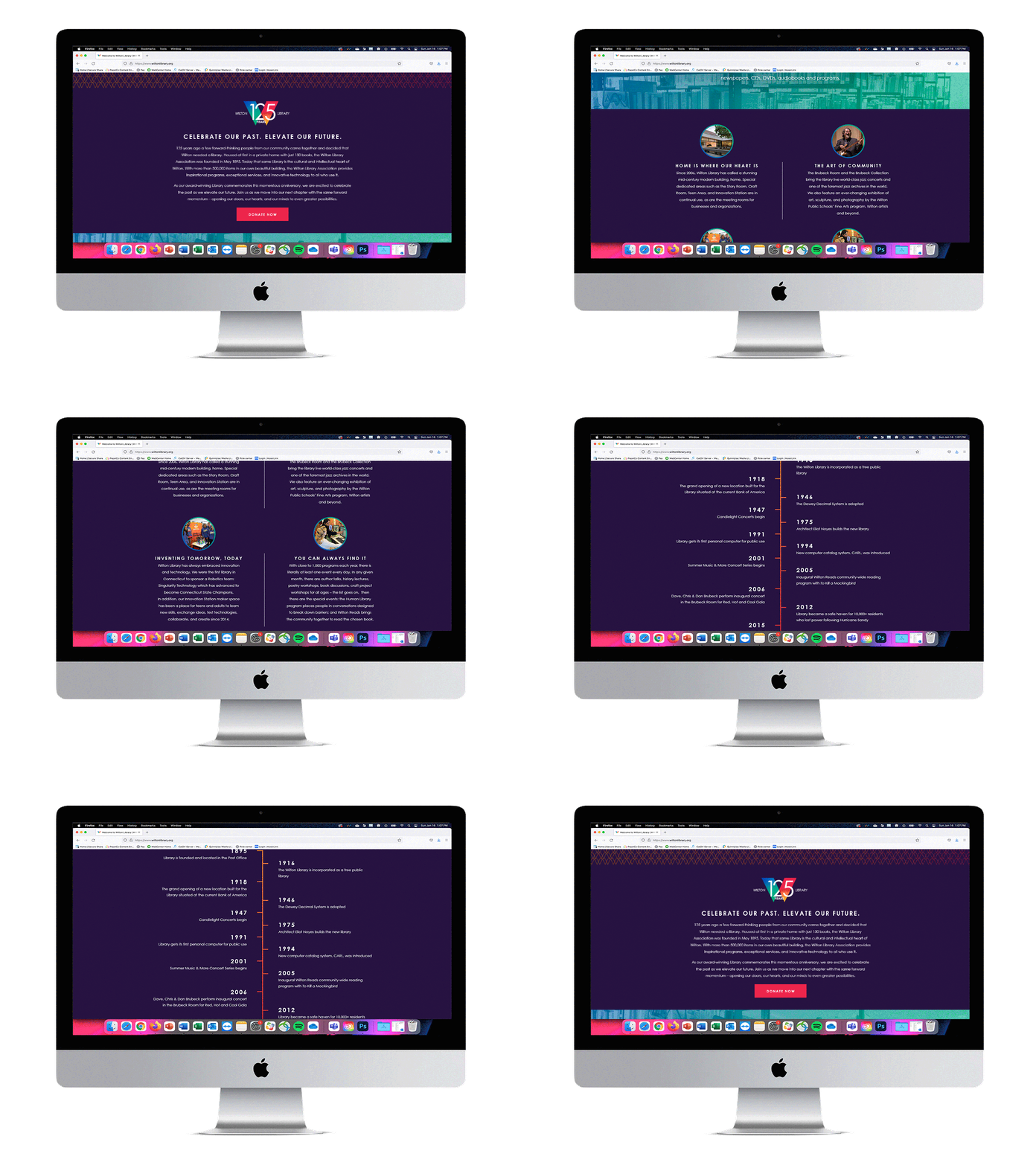
To celebrate the anniversary, a variety of elements were designed around the town of Wilton including banners displayed in light posts, commemorative books, a microsite and a brochure for new residents.
As the library is not fully funded by the town, the goal of painting the town purple was to raise awareness of the milestone year and to solicit donations.
The results
The Board of Directors loved this look so much that they decided to use this look as their new permanent logo. With a few small changes, the logo is a modern approach blending the old mid-century modern look with the digital future.


