Starbucks Key Visuals
I lead the work for the Starbucks ready-to-drink products found in grocery and convenience. Each product that will be featured that year will need a key visual that the internal Starbucks team could then apply to a myriad of elements from pre-shop to in-store, from displays to billboards.
These visuals take the current Starbucks Cafe style guide and rethink it for the retail environment where there is intense competition to get the shoppers attention between brands. Our goal across all layouts is to tap into the instantly recognizable Starbucks look to get shoppers excited while also help them understand the product.
We try to balance the fine line of giving each brand a personality while staying within the core Starbucks look and feel. Below are just a few examples of the key visuals we create for the team each year.
Starbucks Frappuccino Passports
With the launch of new Frappuccino Passports, my team was charged to create a unique key visual that would introduce shoppers to the travel-inspired flavors while maintaining the brand’s fun, colorful and youthful vibe. We also tapped into the current advertising campaign for Frappuccino called Flavor That Pops to blend the Above the Line messaging into the retail environment.
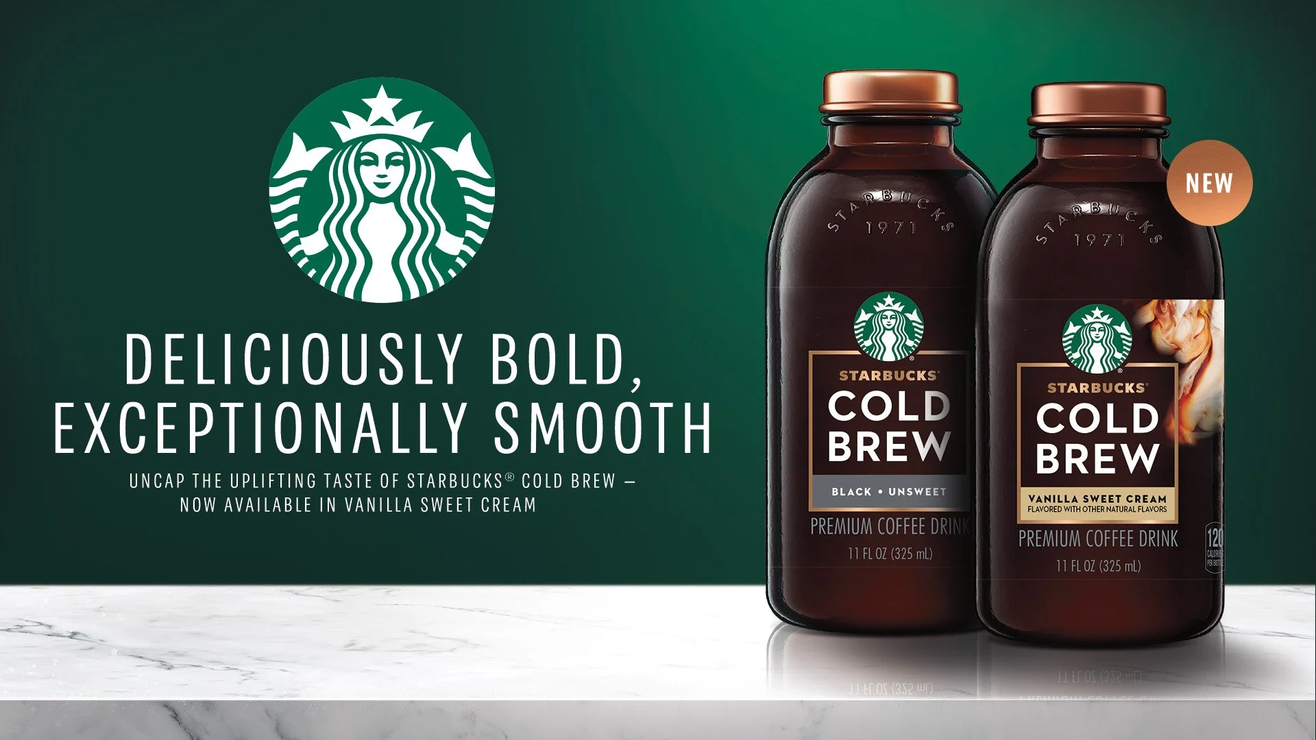
Starbucks cold brew
The Starbucks Cold Brew line is one of the more coffee forward and premium offerings in their ready-to-drink lineup. To reinforce the premium price point, we leaned into a rich dark green, high end marble and bronze in our visual. The key visual reinforces the taste, quality and cafe-inspiration that you can enjoy at home.
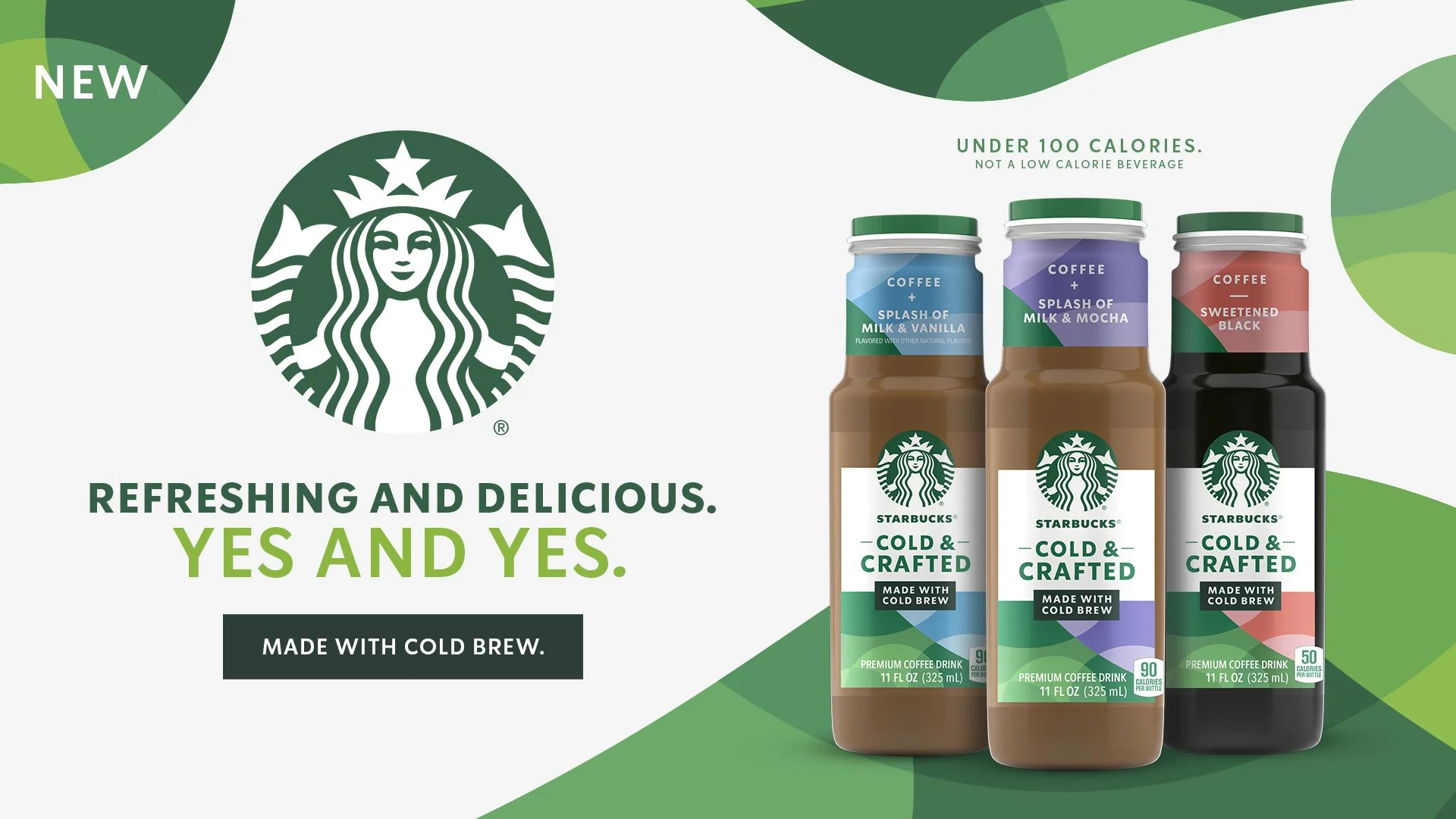
Starbucks cold & crafted
With the launch of a new friendly and simple coffee forward product called Cold and Crafted, their client team was looking to have us help them create a unique brand voice in store. Leaning into shoppers with smaller budgets than the usual Starbucks shopper, this brand is the friendly, fun and approachable version of Starbucks Cold Brew which we reflected with the bright color palette and whimsical shapes. The headline and copy helps shoppers understand the product taste as well as give it a personality.
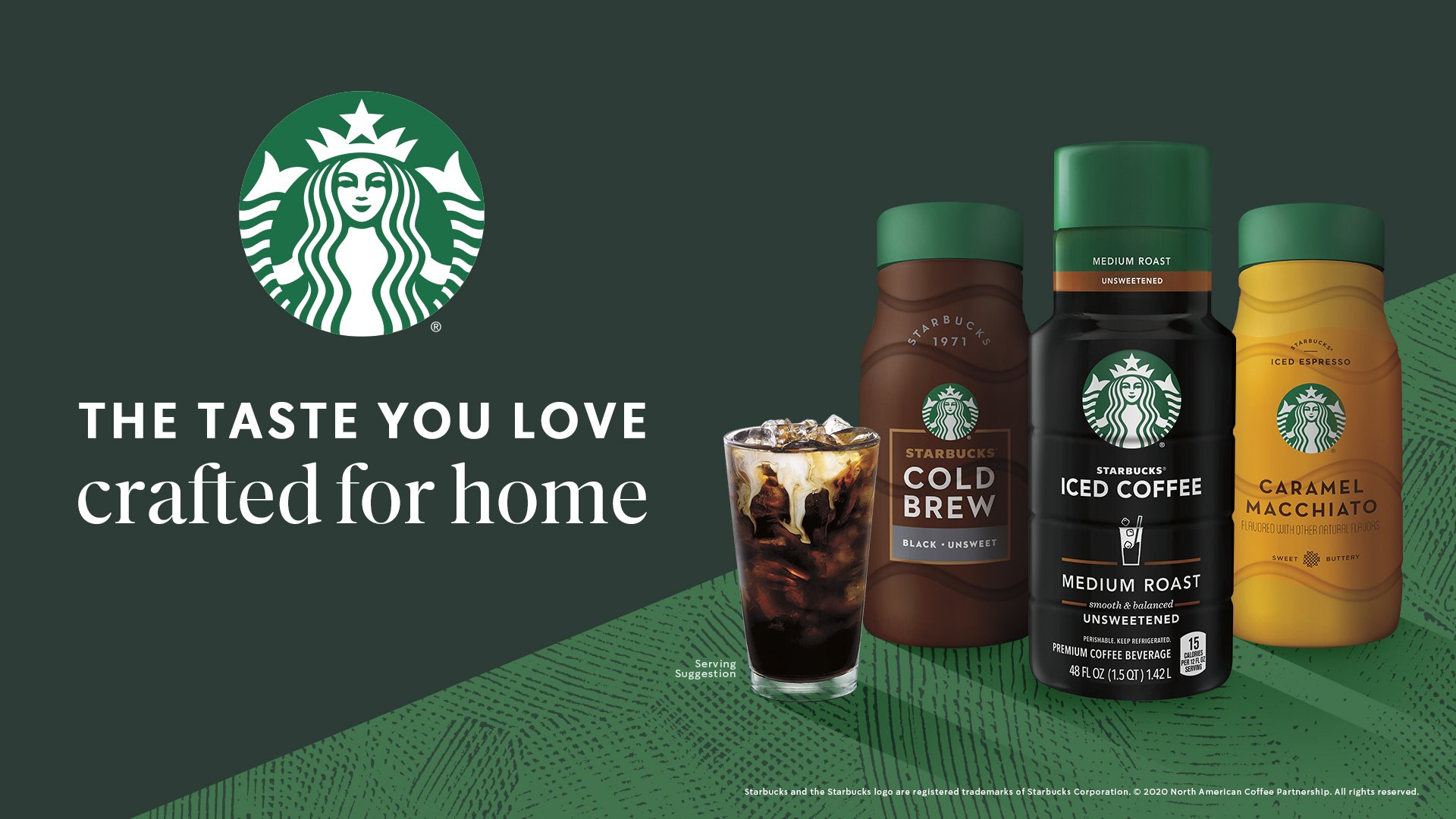
Starbucks chilled portfolio toolkit
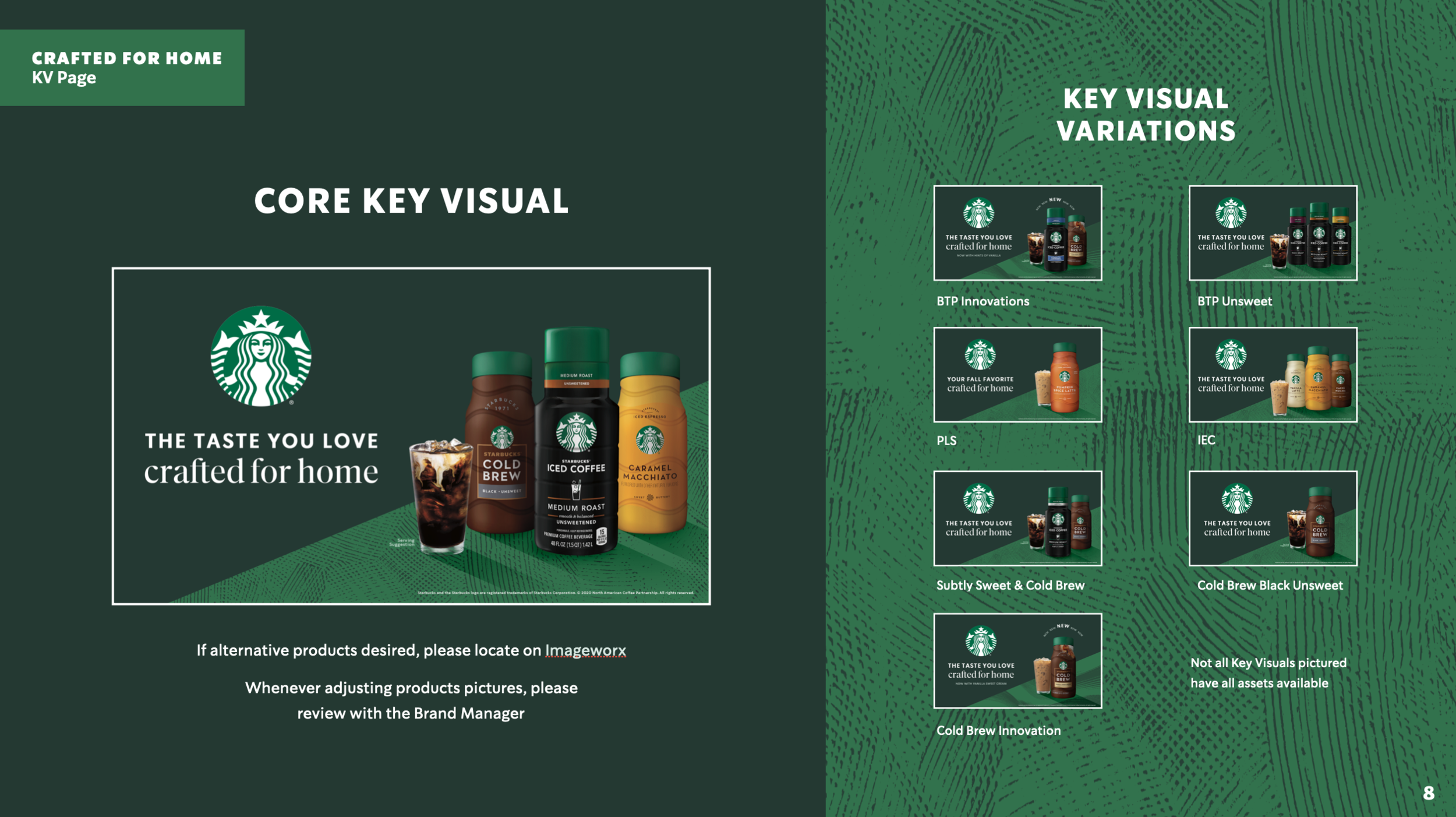
This portfolio key visual helped support the entire refrigerated ready-to-drink coffee products. The clients needed the look to be flexible enough to work across a variety of products while also reinforcing that these are the same Starbucks flavors you know and love from the cafe. To do so, we kept the look simple with crafted textures and beautifully lit bottles while highlighting the instantly recognizable “Starbucks Green”.
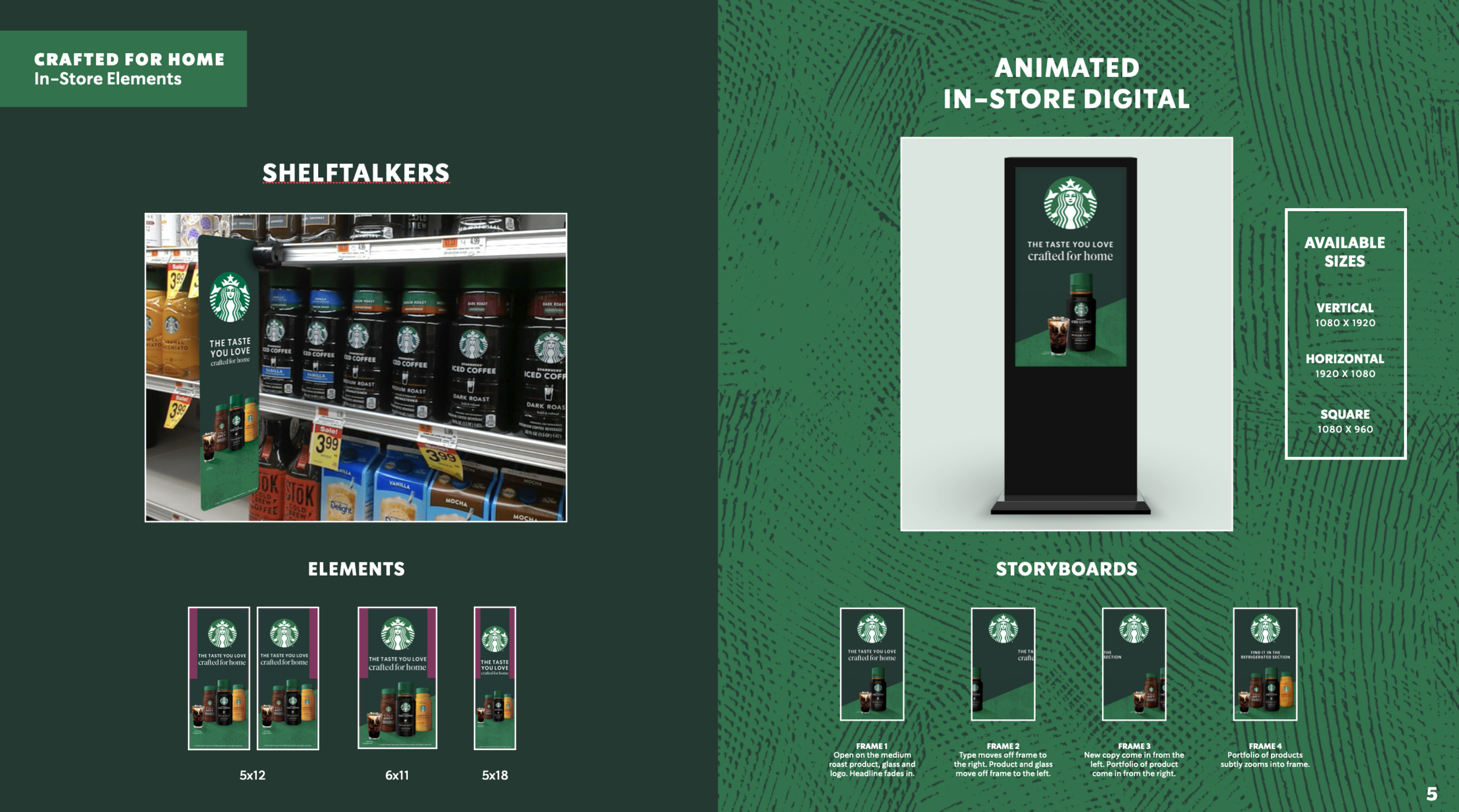
The toolkit included templates for a variety of print and social elements including banners ads, shelftalkers, animated POS, DOOH and a variety of product lockups in layout.

